
Banat Toothbrush Logo and Packaging Designs
Celebrating it’s 20th anniversary in creative packaging design, Orhan Irmak Tasarim was responsible for completely redesigning the brand architecture and logo of the Turkey's leading toothbrush brand Banat.
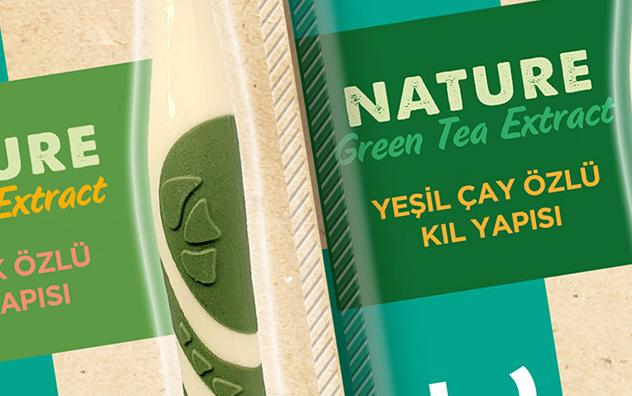
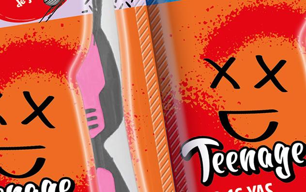
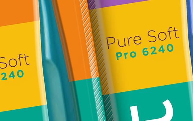
The new logo was designed with a timeless language. The aim was for the rebirth of the brand to tell the story of a long-term journey instead of seasonal trends. Considering the categories in which the brand is present and aimed to expand, a stance closer to personal care and cosmetics was adopted. With the turquoise chosen as the brand color, the aim was to clearly differentiate the brand from other competitors and to open up to the global market with a color that is our own. The logo was used vertically in accordance with the vertical structure of the packaging and ensured maximum visibility for the brand. The simple language of the logo design was carried to the separation of product categories with color codes within the packaging architecture. In the Teenage series, which is a first in the category, the visual world of the target audience was reflected to the packaging architecture and it was ensured that the series had its own style.
Established in 2004, Orhan Irmak Tasarım is the leading branding and packaging design agency in Turkey. To date, Orhan Irmak Tasarim has received nearly 100 awards in national and international design competitions on packaging design including Red dot, Pentawards, WorldStar and Design Turkey. The agency is a member of GLBA – Global Local Branding Alliance. In addition to its Istanbul office, GLBA also has offices in New York, Berlin, Shanghai, Moscow, Sao Paulo and Johannesburg.


