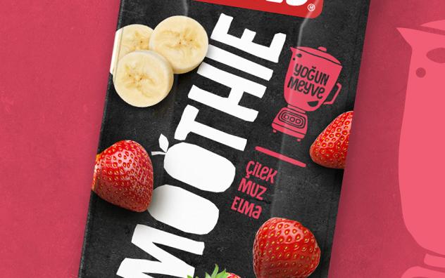

Dimes Smoothie Packaging and Logo Designs
We designed the logo and packagings for Dimes Smoothie. Founded in 1963, Dimes is the biggest fruit juice producer and the most consumed fruit juice brand in Turkey. Innovative products have been recently added to the fruit juice portfolio, smoothie is one of them and reflects the rejuvenation and modernity of the long-established brand.
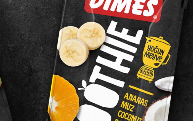
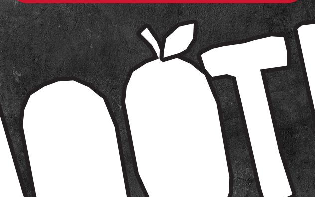
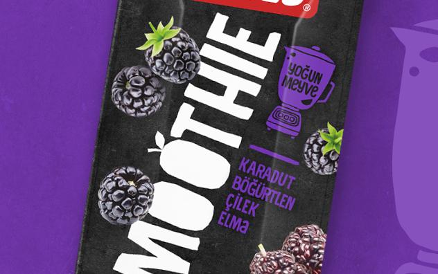
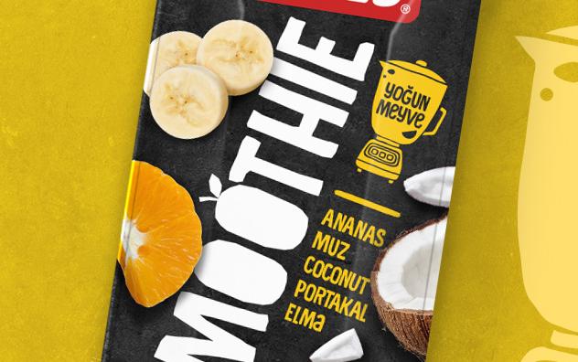
Imagine putting lots of fruits and vegetables in a blender and preparing a delicious drink. The new Dimes Smoothie packagings were designed to give this exact feeling. To achieve a cool look that will capture young consumers’ attention, we used lively colors for texts and illustrations. We chose a black background that creates contrast and stands out from other Dimes packagings on the shelf. Slightly tilted diagonal logo design is created with irregular letters and fruit illustrations to reflect the brand’s inspiring side. The blender icon with “rich fruit” claim, emphasize the real fruit and vegetable pieces inside the products.
Our Design Director Dr. Orhan Irmak says, “We imagined a counter top, where you prepare a smoothie with fresh fruits and vegetables in a blender for your breakfast. It is a little bit messy yet colorful and full of joy! This is exactly what we tried to reflect with the visual language of our design for Dimes Smoothie packages.”
Established in 2004, Orhan Irmak Tasarım is the leading branding and packaging design agency in Turkey. To date, Orhan Irmak Tasarim has received nearly 100 awards in national and international design competitions on packaging design including Red dot, Pentawards, WorldStar and Design Turkey. The agency is a member of GLBA – Global Local Branding Alliance. In addition to its Istanbul office, GLBA also has offices in New York, Berlin, Shanghai, Moscow, Sao Paulo and Johannesburg.

